
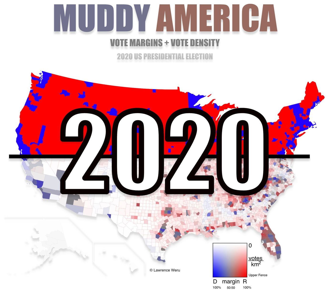
2020 Presidential Election County Level Muddy Map
2020 US Presidential Election Interactive County-Level Vote Map
Muddy America 2020 : Vote Populations & Margins of Victory - Interactive
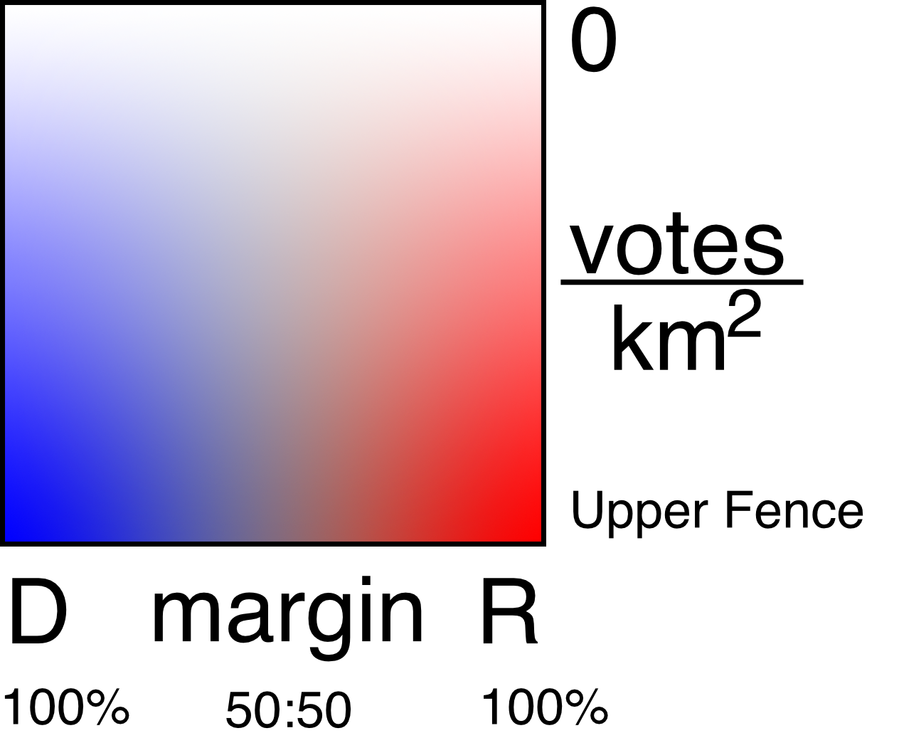
This 2020 Presidential Election Muddy Map shows county-level vote margins and vote density in a 2-dimensional scale.
To view in full screen - click the hamburger menu icon, then click "view in full screen".
Interactive - hover over counties to learn more about their vote totals and margins. You can double-click to zoom in.
If this is your first time viewing a Muddy Map, click here to read more about Muddy Maps, the problem they address, and the maths and colour theory behind the two-dimensional key.
What's new in the 2020 edition?
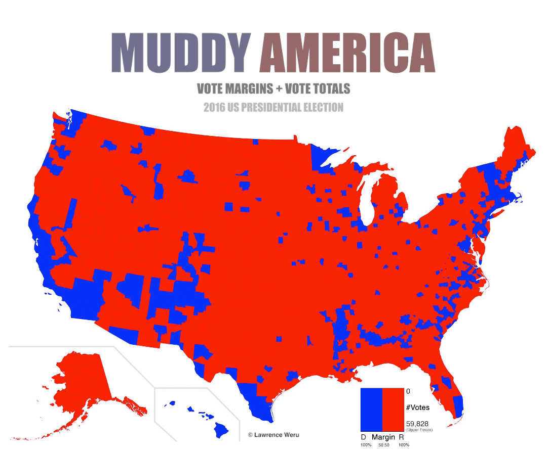
While the 2016 Muddy Map uses vote totals on the vertical scale, this 2020 version has been upgraded to use vote density (in Votes / km^2). This more accurately accounts for disparities in land area, since county areas can vary by three orders of magnitude.
Current upper fence: 50.66 Votes / km^2
Note:
This map is regularly updated with the latest data that we receive. Votes are still being counted. Some counties in this map may have incomplete data, and relative vote totals may still be in flux. In addition, we don't have Alaska vote data processed yet, so Alaska is blank, for now.
Credits and data sources:


