
Muddy America : Color Balancing The US Election Map - Infographic
The Trouble with the County Winner Map, and why this Muddy Map is better for determining vote populations and vote margins in the US election. Infographic.
2020 update: Click here to view the 2020 Muddy Map
Graphs can inform, and informed discussions can be more civil than uninformed ones. But graphs can also mislead, so we need to understand what a graph is saying when we're using it. In 2015 I gave gave a TEDx talk on making clearer election maps. The original recording was lost, then recovered and uploaded to Youtube this summer. As election season ramps up, I'd like to continue the discussion by talking about this often-misleading map.
It’s not what it looks like.
Different graphs are designed for different purposes. The graph above is a county-level winner-takes-all map. I'll call it a County Winner map for short. Scientists use it to quickly see which way the counties went in an election. While there is arguably no better map for seeing who won in which county, this map can be misleading when used for other purposes. We need to be aware of two of its characteristics:
- It doesn’t express the relative voting populations between each county. Instead, it can make people feel like each county has the same population.
- It’s not designed to express the margin of victory within each county. It shows who won in a county, even if they won by just one vote. It’s a winner-takes-all graph, after all.
Relative Voting Population
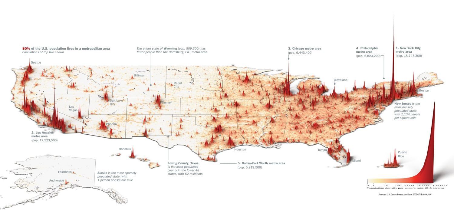
Half of the US population lives in these counties:
America can be described as a collection of densely populated metros buffered by less densely populated communities. Here’s what the population mountains look like:
When we take the County Winner map and resize each county’s land-area to be proportionate to its population, here’s how the US looks.
One downside to the cartogram, however, is that the shape and location of many territories are distorted beyond recognition. This is maybe one reason why the cartogram isn't very mainstream.
The County Winner map, however, doesn’t convey this relative population information. It's not designed to. But one might think it does.
Margin of Victory
In the general election, there are 50 concurrent presidential races, one for each state. In some of these states, the margin of victory turns out to be very small. In New Hampshire, 743,117 votes were cast for the president in the 2016 general election. Hillary Clinton won New Hampshire by 2,701 votes. We can seat as many people in a set of high school football bleachers.
There was a 75.03% turnout in New Hampshire, so more people could have voted that didn’t. If just 2,702 more eligible voters in New Hampshire exercised their right to vote and voted for Trump, then New Hampshire would have gone to Trump instead. With such hair thin margins, New Hampshire is neither Blue nor Red in 2016. It’s 50:50 and leaning red or blue depending on traffic and dinner plans. It would be misleading to have all of New Hampshire colored as either blue or red to represent the statewide popularity of a presidential candidate.
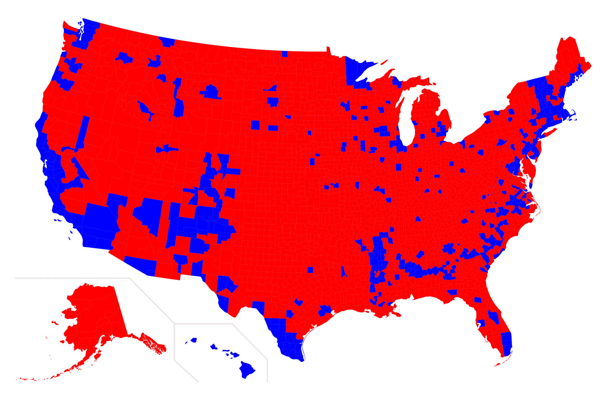
This characteristic also holds true at the county level. The losing candidate in a county can receive a significant number of votes. In many counties the winner won by less than a 25% margin.
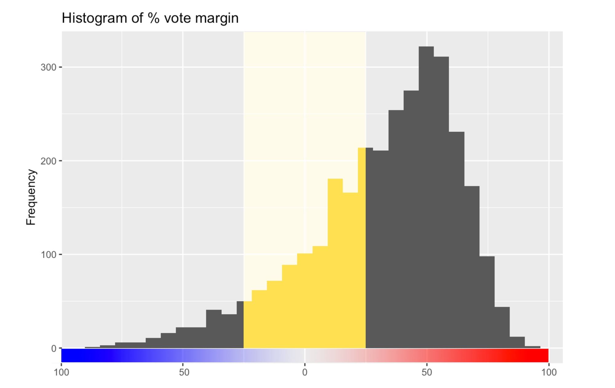
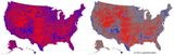
A margin of 0 is 50:50. Clinton's county-level percent-win margins are on the left. Trump's county-level percent-win margins are on the right. The yellow area highlights counties won with vote margins within 25%. Note that these are percent vote margins, not absolute vote margins
In general, smaller counties were won by larger percent margins. Larger counties were won by smaller percent margins. So in the counties with the most votes cast, the runner up got a lot of votes, too.
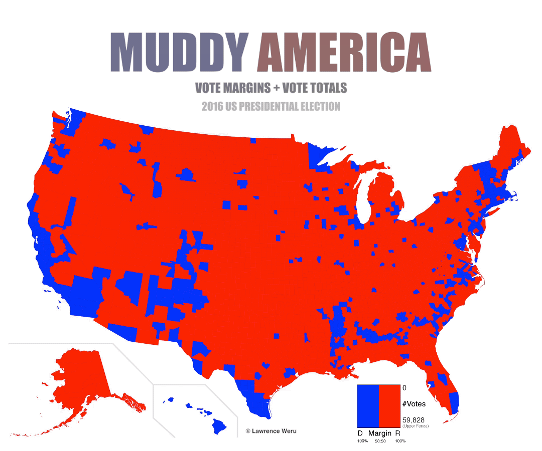
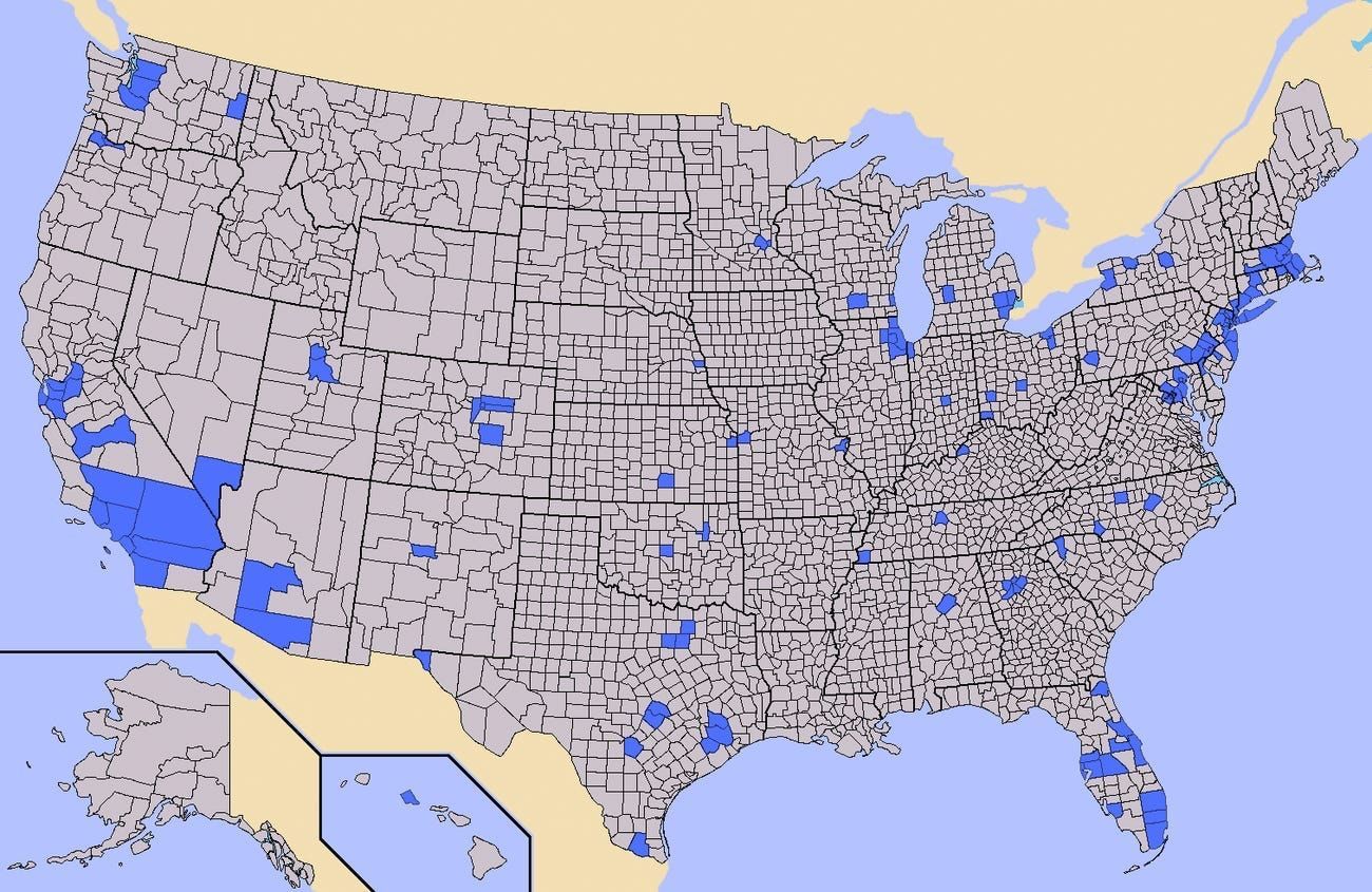
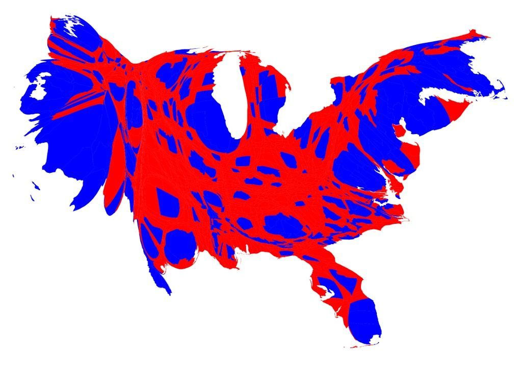
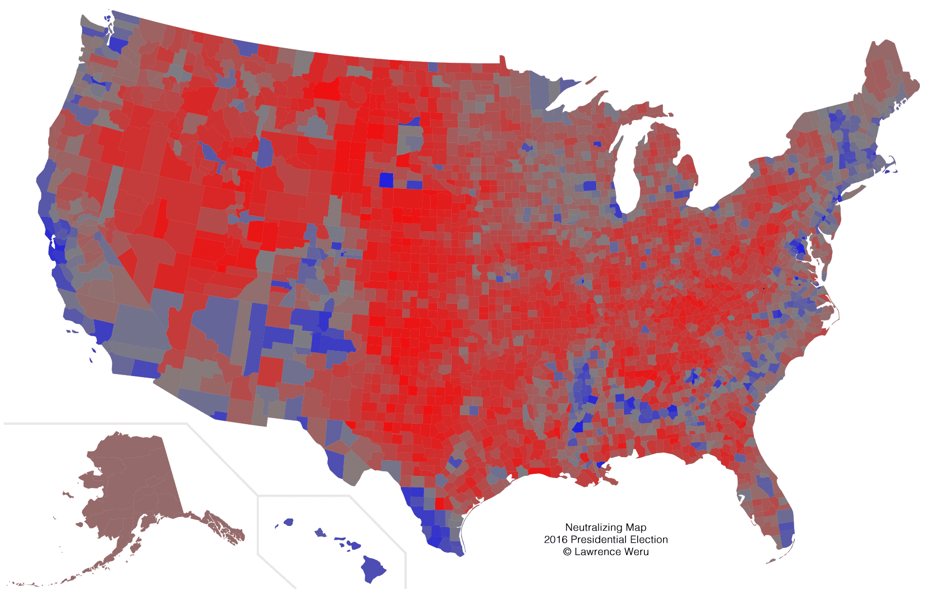
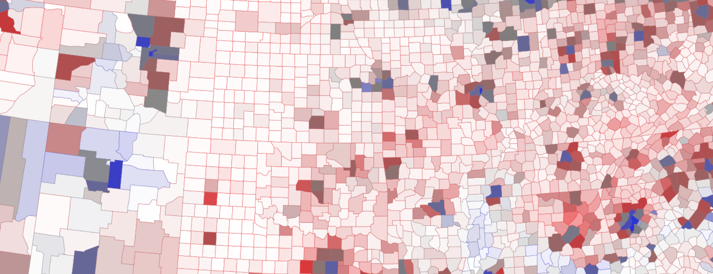
Here’s what the County Winner map looks like when we account for vote margins by blending each red and blue vote together within each county. Purple represents 50:50:
The neutralizing map is designed to express vote margins more clearly. It uses a grey intermediary, adjusting for the way humans perceive purple. Here’s the 2016 neutralizing map:
Rarely are all of the votes in a county cast for one candidate. The County Winner map, however, doesn’t convey this win margin information.
Color-Balancing the Election Map
The contiguous United States aren't very contiguous. The County Winner map's inability to express vote population and margin of victory can be misleading. Cartograms account for population, but they distort the shape of the US, which can add confusion. The neutralizing map accounts for vote margin, but it doesn't account for population.
Can we construct a single map that shows both vote margin and vote population without distorting the shape of the US?
Here's one way:

Here's a less-distracting, static version of the graph:
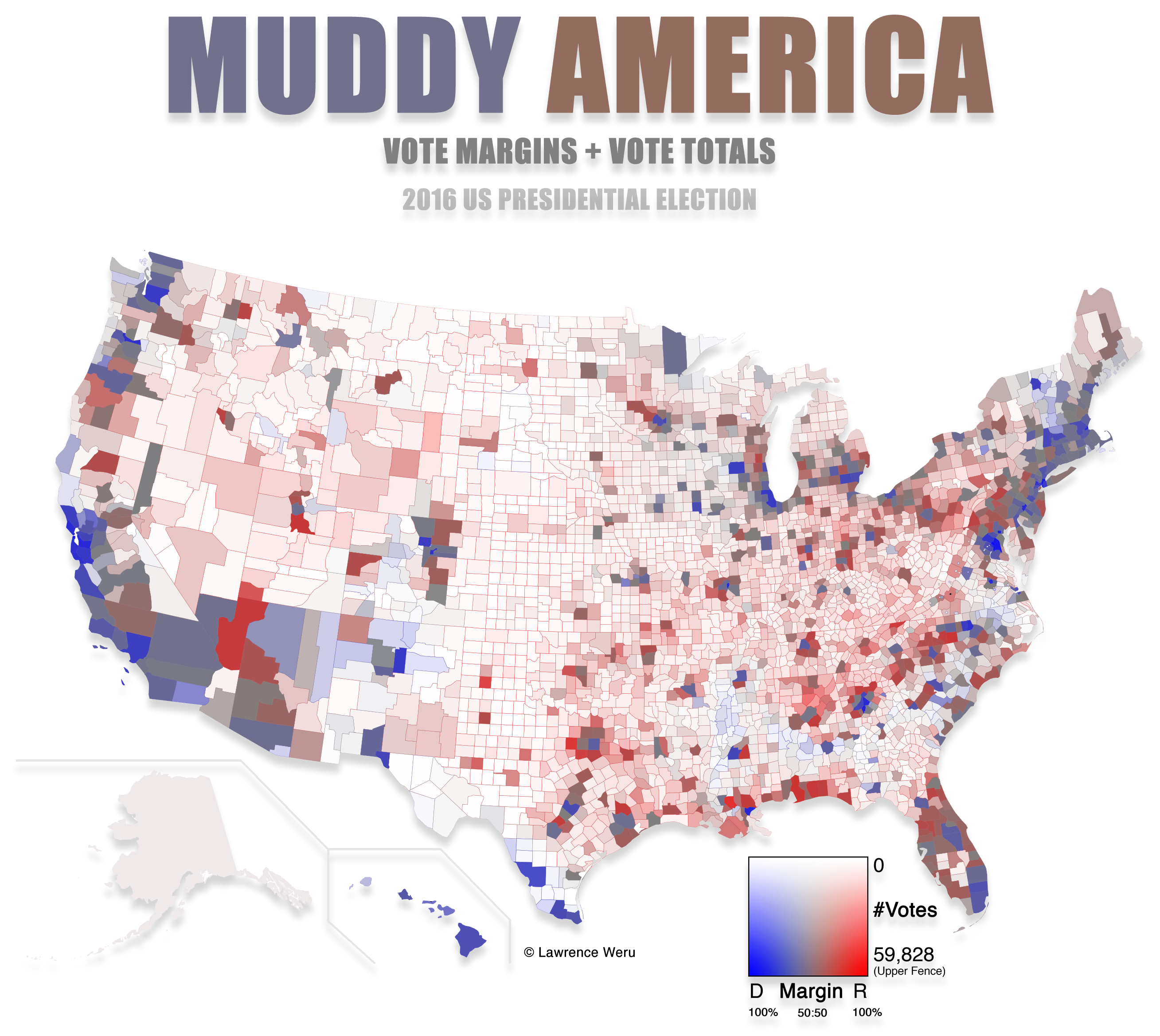
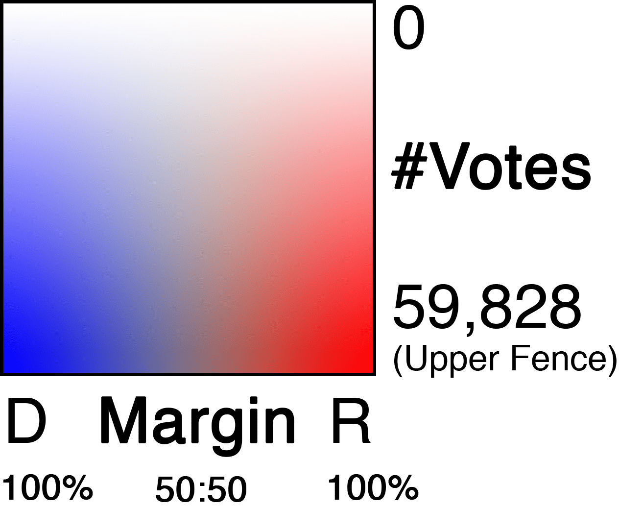
The map leverages Color Theory to express vote margins and vote populations in a 2-dimensional scale.
Here's the key blown up:

Horizontal scale represents vote margins. Vertical scale represents vote totals.
Lightness (Vertical Scale)
The lighter counties had fewer votes. The darker counties had more votes.
Hue + Saturation (Horizontal Scale)
The closer a county gets to gray, the closer the votes were 50:50.
A highly saturated red county was won by Trump with high percent vote margins. A highly saturated blue county was won by Hillary with high percent vote margins.
The mathematics of the muddy map
HSL
All colors can be described as a combination of Hue(°), Saturation(%), and Lightness(%).
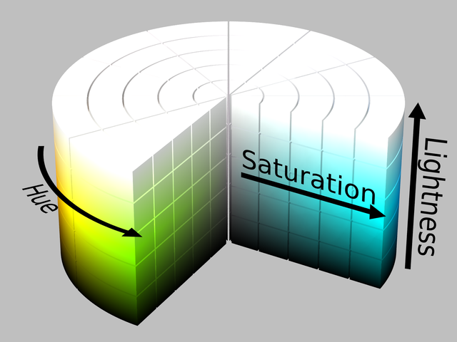
We can leverage these individual components of the HSL color model to faithfully express 2-dimensional data such as vote totals vs margin on a 2d color scale.
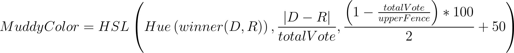
County Fill Colors
The fill-color of each county is constructed using the MuddyColor algorithm, which is expressed as the following mathematical formula:
This produces the following two dimensional scale, which also doubles as a map key, with the upper fence labeled for the 2016 data set:
County Border Colors
For the borders of each county, I use the same formula, but just give them a constant lightness (L) of 50%.

This results in a 1-dimensional scale which we use for the county borders. It's the same color-scale scale used in the Neutralizing Map, which is designed to more-accurately express vote margins. Left = higher DEM %margin. Right = higher GOP %margin.

Giving each county an opaque border color allows even the lightest-filled counties to be recognized, including their vote margins.
You don't need to look at the whole nation to see where one county's vote total lies on the overall lightness scale. The county border color and the county fill color differ only by lightness, so the greater the contrast between a county's border color and its fill color, the lower its vote total.
Upper Fence
A few counties have enough votes to skew the vote totals scale. Here's how the graph looks when the vote totals scale maxes out at 2,514,055, the maximum number of votes in a county:


